Writing Test Overview
Introduction for Task 1
Task 1 requires you to report the data which can be shown in a form of table, chart, pie, line, map, flowchart or mixed data. In Task 1, you have to:
- Select the main features
- Report the main features
- Make comparisons were relevant
- Write at least 150 words at least 160-165 words
How to answer Task 1?
- Spend 20 minutes on Task 1
- Tips: do the Task 1 after you finish Task 2
- The score of Task 1 is one-third of the whole writing task
Test Format
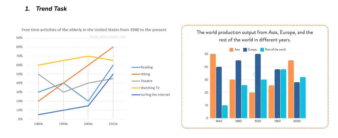
1. Trend Task
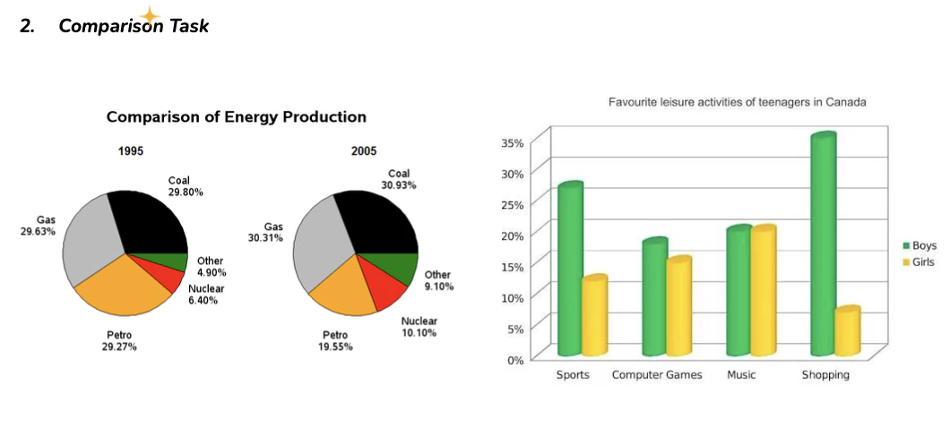
2. Comparison Task
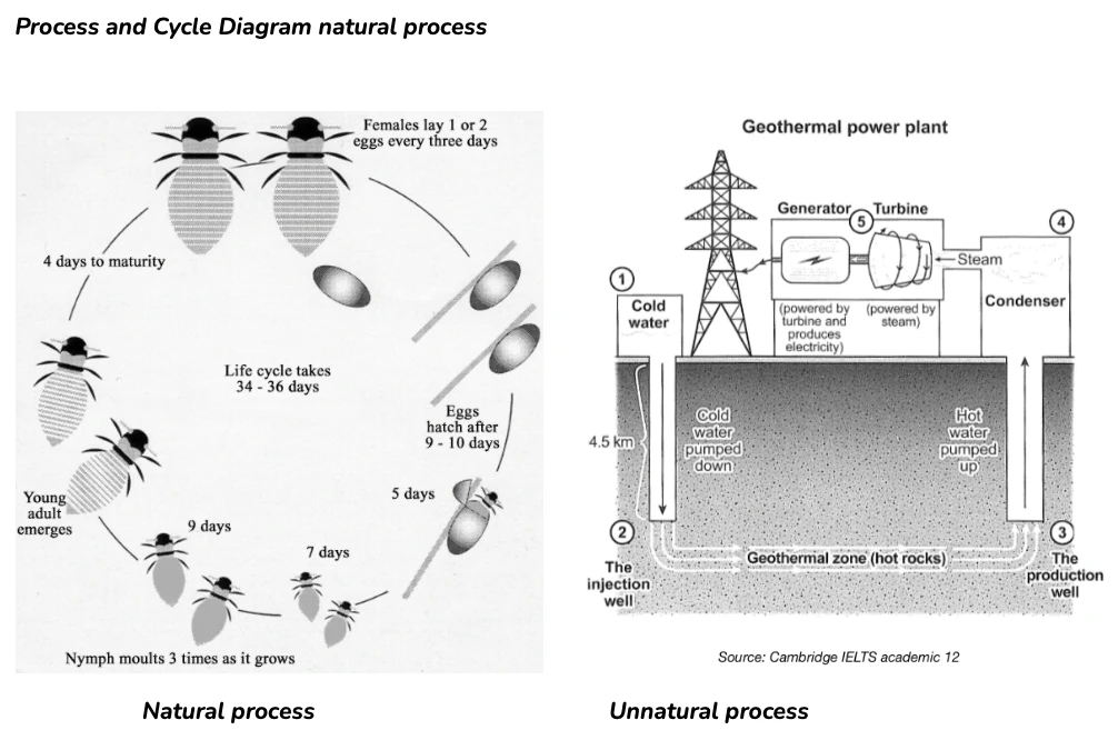
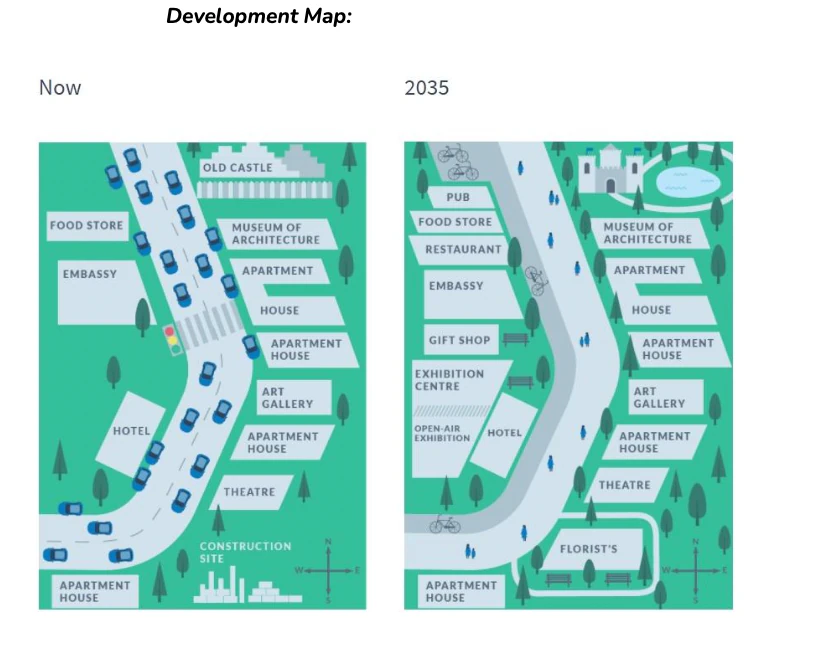
3. Process and Cycle Diagram natural process
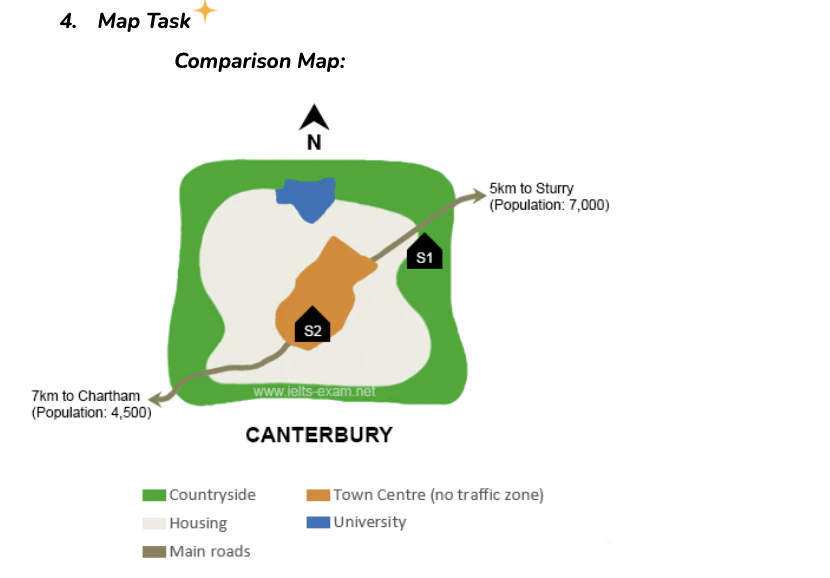
4. Map Task
5. Mixed Task

How is the test marked?
There are 4 key assessment criteria in Writing Task 1: Task Achievement, Coherence and Cohesion, Lexical Resource, Grammatical Range and Accuracy
Task Achievement:
Ask yourself these questions:
- Have you summarized the information appropriately by selecting and properly reporting the main features?
- Have you made comparisons properly and sufficiently?
- Have you provided overviews of the main trends/comparisons/stages?
- Have you written a clear overview or summary for the report?
Coherence and Cohesion
Ask yourself these questions:
- Have you organized your information logically?
- Is there an overall flow or progression in your report?
- Have you used linker correctly, properly and sufficiently?
- Have pronouns been used correctly and do they have clear references?
- Have you organized the text in paragraphs logically and sufficiently
Lexical Resource
- Words
- Range and flexibility
- Level
- Precision
- Style
- Collocation
- Vocabulary mistakes
- Spelling
- Word choice
- Word formation
Grammatical Range and Accuracy
- Have you used a variety of sentence structures?
- How often have you used compound structures?
- Mistakes
- Grammar
- Punctuation
General Structure
- Introduction: Paraphrasing the rubric.
- Overview: Summarizing the main trends or the most remarkable features
- Main Feature 1: Describing the first main feature
- Main Feature 2: Describing the second main feature
General Strategy
| Before you write | While you write | After you write |
|---|---|---|
|
| Recheck your work. Make sure:
|
General Key Tips
- DON'T add your opinion. Also, never explain why things happen. Just describe what you see.
- No contractions
- No "I" or "you"
- Always paraphrase where possible
- DON'T include any personal opinions
- DON'T try to include everything
- Writing an overview is a must
- Be careful of verb tenses
- Try to write 4 paragraphs
- . Don't write too long!
Line Chart
Test Sample
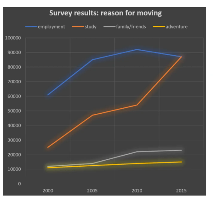
The line chart below shows the results of a survey giving the reasons why people moved to the capital city of a particular country.
Answer: (186 word counts)
The line chart depicts the reasons (employment, study, family/friends, adventure) for people relocating to the capital cities of specific countries between 2000 and 2015. (Introduction)
Overall, the factors of employment, study and family/friends for migration showed a significant rise, while the cause of adventure did not exhibit a dramatic increase from 2000 to 2015. (Overview)
In 2000, employment, study, and family/friends purposes were almost 60,000, 20,000 and 10,000 out of 100,000, respectively. Employment, the most popular motive in 2000, experienced an upward trend, reaching close to 90,100 by 2010. However, between 2010 and 2015, it faced a drop to nearly 88,000. Meanwhile, the reason for study demonstrated a substantial increase throughout the duration. At the end of the period, employment and study reached a peak of about 88,000. Likewise, the factor of family/friends illustrated an increment between 2005 and 2010. In other years, it remained almostconstant. At the conclusion, it experienced a twofold increase and obtained approximately 23,000.
(Main Feature 1)
In comparison, adventure became the most stable factor during the period. Although there was a slight increase, it did not change much and became almost 12,000 from 11,000. (Main Feature 2)
Warm-Up 23
Look at the line chart below, and mention 2 main features from the picture!
You should spend about 20 minutes on this task.
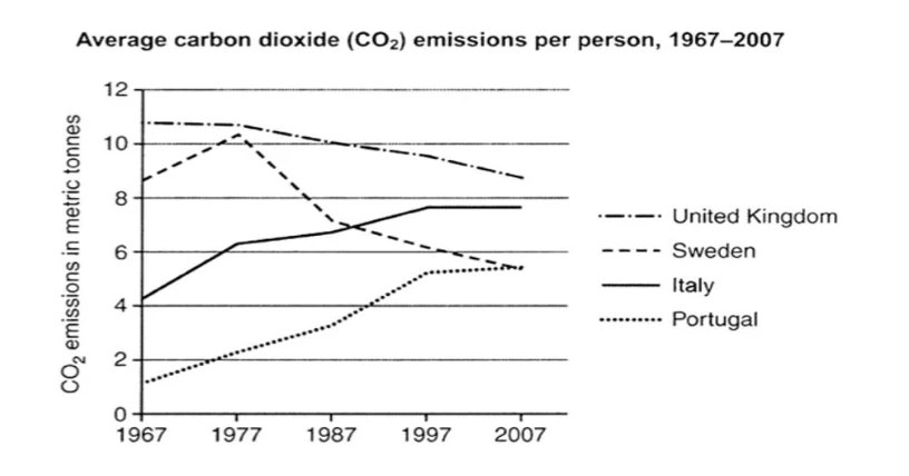
The graph below shows average carbon dioxide (Co2) emissions per person in the United Kingdom, Sweden, Italy, and Portugal between 1967 and 2007.
Summarize the information by selecting and reporting the main features, and make comparisons where relevant.
Write at least 150 words.
Warm-Up 24
Let's make an overview for the chart in Warm-up 24 by paraphrasing the rubric!
Paraphrase this sentence into your own version!
The graph below shows average carbon dioxide (Co2) emissions per person in the United Kingdom, Sweden, Italy, and Portugal between 1967 and 2007.
Vocabulary Building
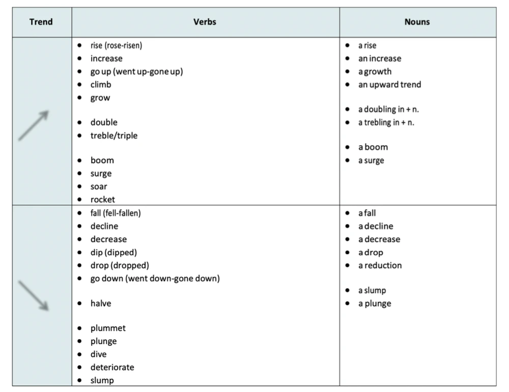
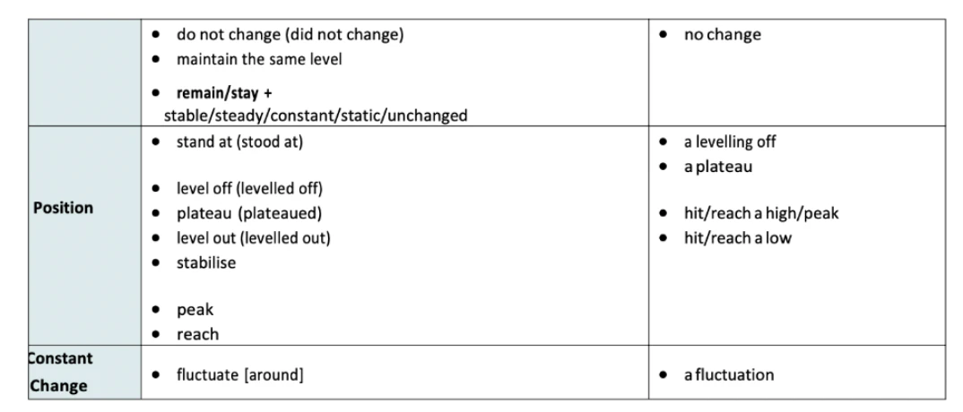
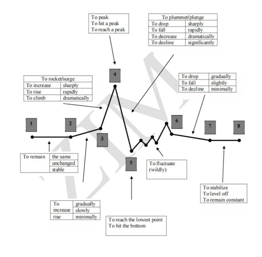
Verbs and nouns for describing trends and changes:
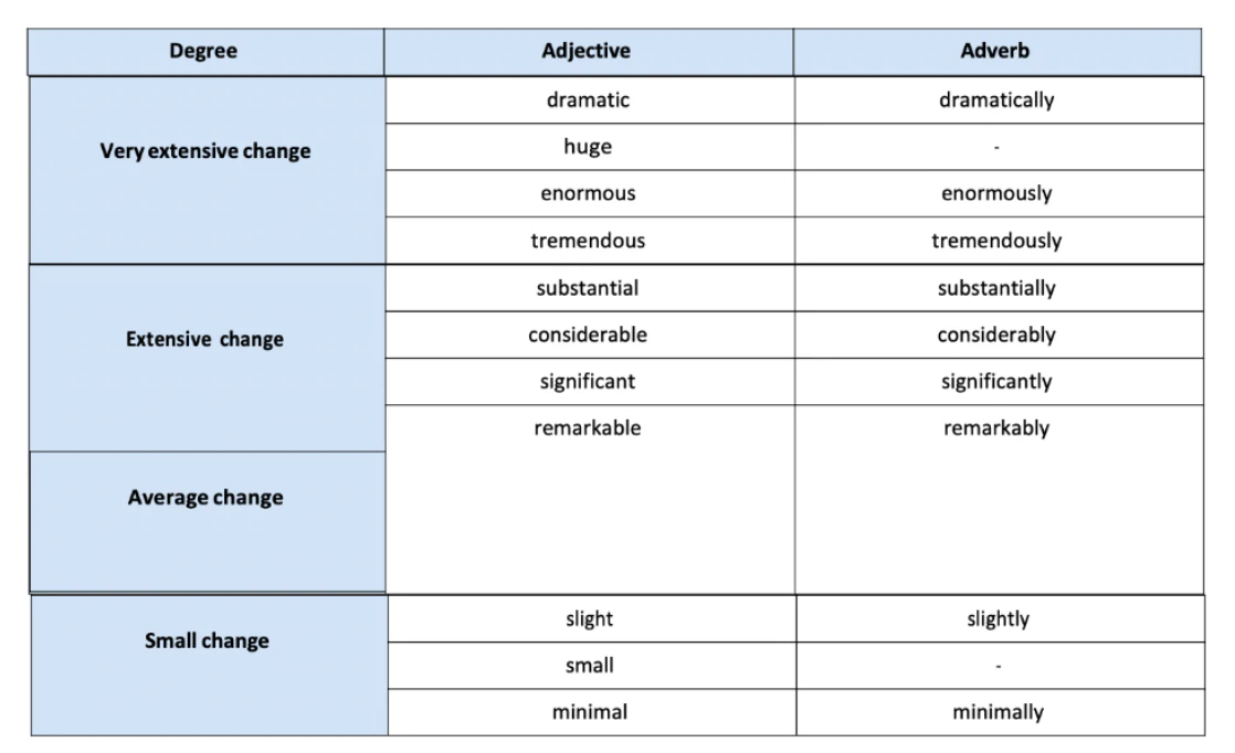
Adjectives and adverbs for degree of change:
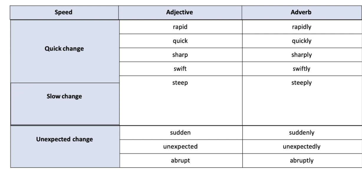
Adjectives and adverbs for speed of change:
Warm-Up 25
You should spend about 20 minutes on this task.
The graph below shows average carbon dioxide (Co2) emissions per person in the United Kingdom, Sweden, Italy, and Portugal between 1967 and 2007.
Summarize the information by selecting and reporting the main features, and make comparisons where relevant.
Write at least 150 words.
Please describe each line using the vocabulary that you have gained beforehand.
Warm-Up 26
Please compile your work from Warm-Up 17,18 up to 19 into the whole-complete essay. Make sure that you have reached 150 words in total.
Mini Practice 50
Writing Task 1
You should spend about 20 minutes on this task.
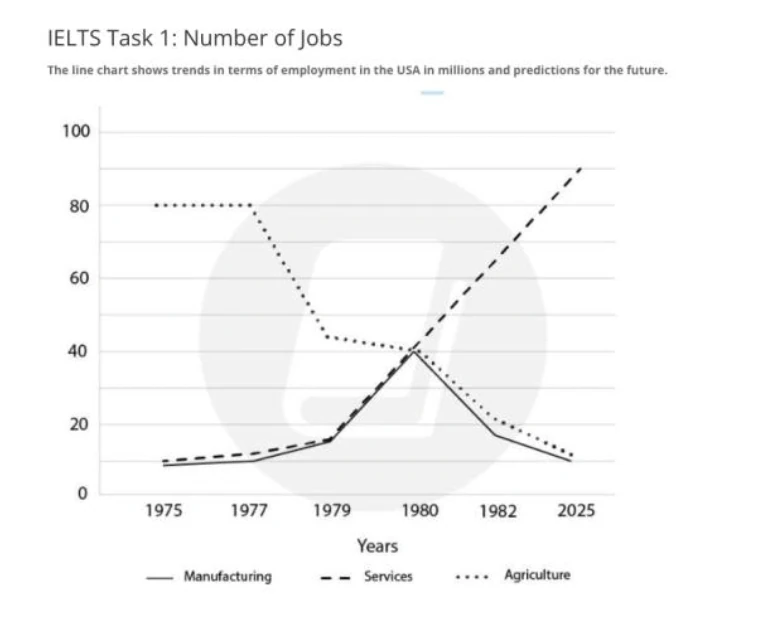
The line chart shows the trends of employment in the USA and predictions for the future.
Summarise the information by selecting and reporting the main features, and make comparisons where relevant.
Write at least 150 words.
Mini Practice 51
Writing Task 1
You should spend about 20 minutes on this task.
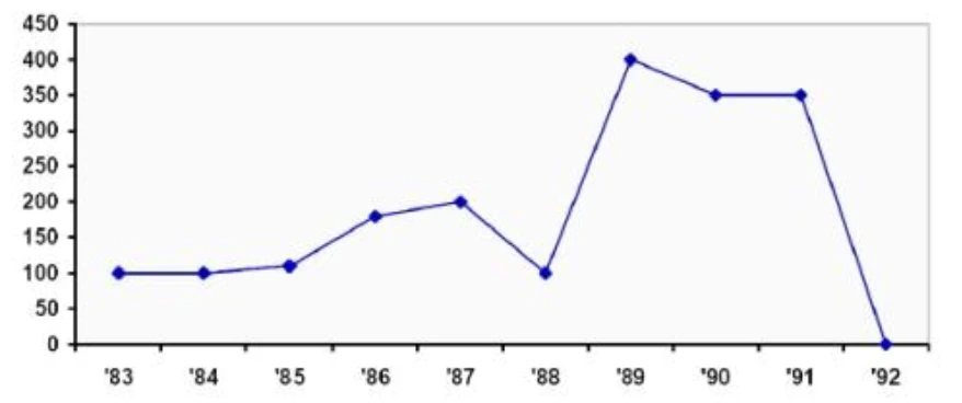
The graph below gives information about the number of cases of diarrhea in Mashhad between 1983 and 1992.
Summarise the information by selecting and reporting the main features, and make comparisons where relevant.
Write at least 150 words.