Pie Chart
Vocabulary Building
To say percentage:
75% or three-quarters or three out of every 4 people/penguins/patients/...
Example:
Other Structures:
| 1. | the | share contribution proportion percentage | of... |
Example:
Other Structures:
| 2. | x | formed accounted for Was responsible for comprised | y% of ... |
| y | contributed | y% to .... |
Example:
Other Structures:
| 3. | The remaining x% |
Example:
Warm-Up 27
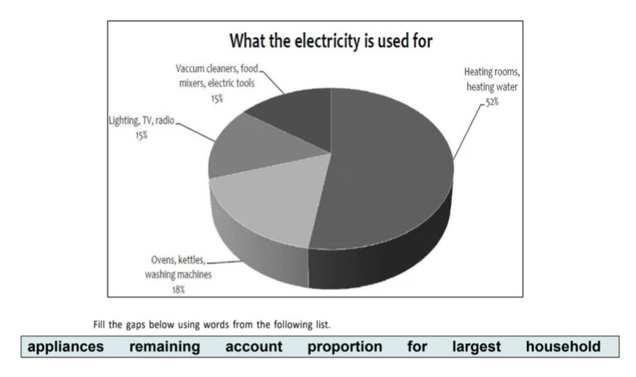
In an average English home, the of electricity, 52%, is used for heating rooms and water.
Three kitchen , namely ovens, kettles and washing machines, 18% of electricity use.
The 30% of electricity is used for lighting, televisions and radios (15%), and vacuum cleaners, food mixers and electric tools (15%).
Writing Sample (Band 8)
The pie graph show the nutritional consistency of two dinners
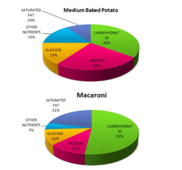
The pie graphs illustrate the way nutrients are distributed in two dishes for dinner: medium baked potato and macaroni.
Overall, it can be noticed that both dinners have the highest proportion of carbohydrates.
Besides, the medium baked potato includes the least level of fat.
As can be seen, the percentage of carbohydrates in macaroni makes up 52% which is 17% more than that in the baked potato dish. Meanwhile, saturated fat contributes to 21% of macaroni and this figure is nearly twice as much as that of dinner including potato.
According to the two given pie graphs, the second dominant nutrient in baked potato belongs to protein accounting for 25%, while that in macaroni only halves. In addition, the amount of glucose in macaroni is the same as that of protein in this dish. The share of glucose in the medium baked potato is 4% more than that in macaroni
Word count: 151 words
Mini Practice 51
WRITING TASK 1
You should spend about 20 minutes on this task.
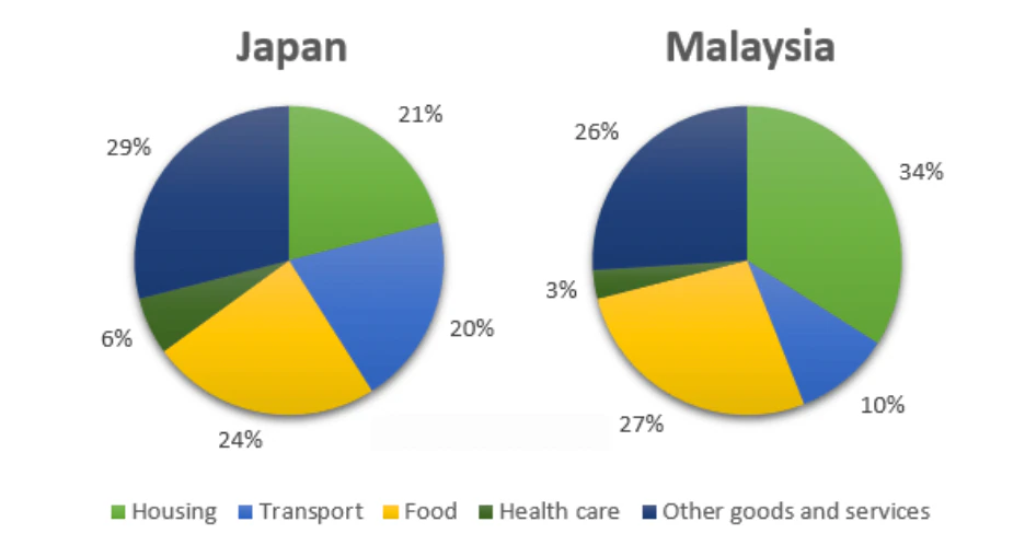
The pie charts below show the average household expenditures in Japan and Malaysia in the year 2010.
Summarise the information by selecting and reporting the main features, and make comparisons when relevant.
Mini Practice 52
WRITING TASK 1
You should spend about 20 minutes on this task.
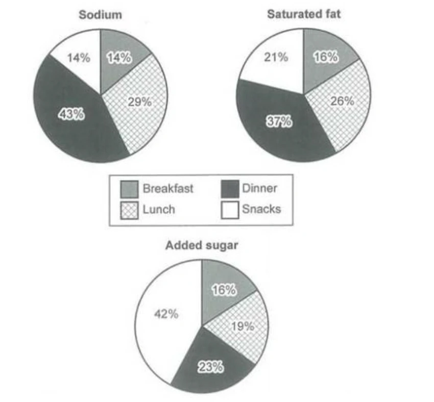
The charts below show the average percentages in typical meals of three types of nutrients, all of which may be unhealthy if eaten too much.
Summarise the information by selecting and reporting the main features, and make comparisons when relevant.
Bar Chart
Vocabulary Building
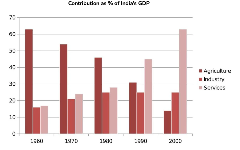
The following bar chart is going to be the example of all the comparative structures examples in this section of the module.
Comparative Structure
| # | Sentence Beginning | Middle | End |
|---|---|---|---|
| 1. | Generally, there is | a significant difference a wide disparity | between a and b in + noun |
| 2. | In contrast (to B), In comparison (with B) | A is larger / smaller | by a narrow margin by x by a margin of x by a staggering x |
| 3. | A is | [just] + [under/over] [approximately] | X larger / smaller than B |
| 4. | A is | considerably / substantially marginally / slightly | greater / higher / smaller than B |
| 5. | A is | [almost / roughly / ...] | as large / high as B |
| 6. | A produces / consumes / ... | more/less + uncountable noun more/fewer + countable noun the same amount/number/quantity of + noun | than B as B |
Examples for 1:
- Generally, there is a significant difference between the percentage of services and industry combined with industry as the GDP contribution of India in 2000.
- Generally, there is a wide disparity in three different sectors as India's GDP contributors over 4 decades (1960-2000).
Examples for 2:
- In contrast, Agriculture is larger by a margin of nearly 25% in 1970.
- In comparison, Agriculture in 1960 is larger by a staggering 45% difference with Agriculture at the end of the given period.
Examples for 3:
- Industry in 1960 is just under approximately 1% smaller than Services in the same year.
- Services in 1970 is approximately 10% larger than Services in 1960.
Examples for 4:
- Industry in 1960 is considerably smaller than Services in the same year.
- Services in 1960 is marginally smaller than Industry in the same year.
Examples for 5:
- Agriculture in 1960 is roughly as high as Industry in 2000.
- The Industry in 2000 is almost as high as Agriculture in 1960.
Examples for 6:
- The Services sector produces more GDP than both Agriculture and Industry sectors in 3 consecutive decades (1980-2000).
- The Services sector in 2000 produced the same amount of GDP as the Agriculture sector in the initial period of time.
Superlative Structure
| # | Structure | ||
|---|---|---|---|
| 1. | A is the [second/third] largest/smallest/most significant/most productive/... + noun A has the [second/third] largest/smallest/most significant/most productive/... + noun | ||
| 2. | A uses produces consumes | The largest/highest/ smallest/lowest | proportion of + number of / quantity of + noun amount of + uncountable noun number of + countable noun |
| 3. | A ranks / stands first / second / third / last | ||
Examples for 1:
- The industry sector is the second largest GDP contributor in 2000.
- The Service sector has the most significant GDP contributor towards India in 2000.
Examples for 2:
- Services produces the highest amount of GDP in 2000.
- Agriculture produces the lowest number of country's income in 2000.
Examples for 3:
- The agriculture sector in 1960 stands first.
- Services sector ranks second in 1980.
Comparison and Contrast Linker
1. Transition
- Over 90% of exports were fruits; however, industrial exports contributed none.
- Almost all female students were interested in art activities. In contrast, the figure for male students was a mere 15%.
- Most of the farmland in Europe was damaged by overgrazing. On the other hand, the most significant cause of damage in Asia was wind erosion.
2. Subordinating Conjunctions
- Over 90% of exports were fruits, whereas / while industrial exports contributed none.
- Whereas / While over 90% of exports were fruits, industrial exports contributed none.
- Although almost all girls were interested in art activities, only 15% of boys took part in them.
Approximation
| 12.1% | Just over 12 percent approximately / around / about 12 %. A little more than 12% |
| 11.9% | Almost / nearly 12% Approximately / around / about 12% little less than 12% Just below 12% |
| 146kg | Almost / nearly 150kg approximately/around/about 150kg Less than 150kg |
Warm-Up 28
Look at the bar chart below.
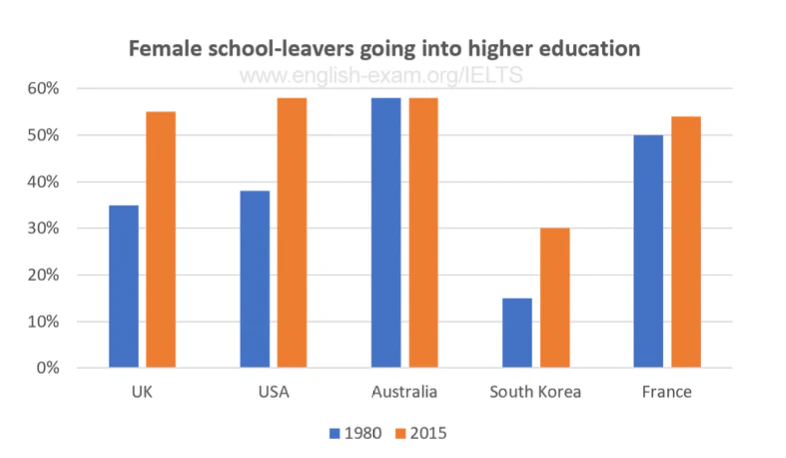
Describe the bar chart above based on the following instruction.
- Compare the data in Australia.
- Describe the difference between the UK in 2015 with the USA in 2015.
- Which of the countries has a slight difference in data between 1980 and 2015? Describe the proof.
- Which of the countries has the least female graduates pursuing higher education? Describe the proof.
- Make an overview of the bar chart.
Writing Sample (7.5)
The bar chart below gives information about the percentage of the population living in urban areas in different parts of the world.
Summarise the information by selecting and reporting the main features and make comparisons where relevant.
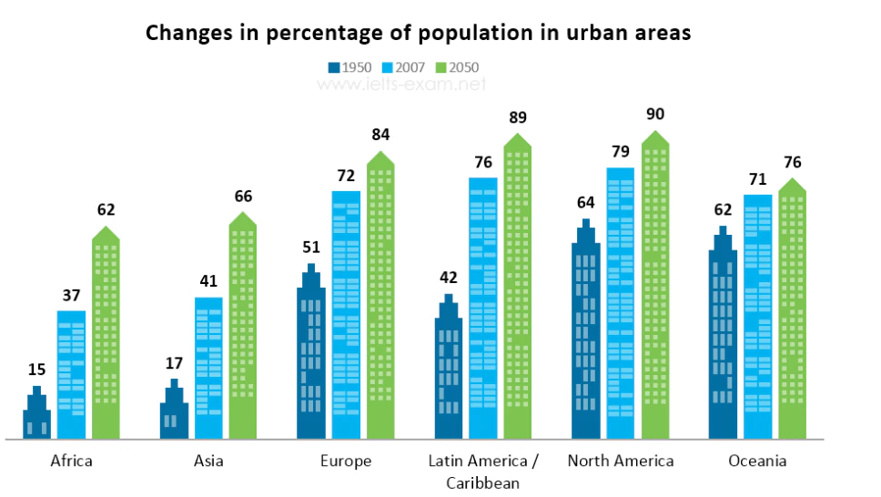
The bar chart gives data about the population living in the six various areas of the world percentage-wise.
Overall, in those countries' urbanization gradually increased chronologically and the expected populationwill reachtheir highest value in 2050. Other than that, in these three particular years, the lowest crowd lived in Africa.
In 1990 North America was the highest populated country and it was 64%, while Africa was the least at 15%. Also, Ochenia gave accommodations to 62% and Asia, Europe and Latin America were 17%, 51% and 42%respectively. In2007 these six regions increase their population and North America was a significant number at 79%. However, Europe, Latin America and Oceania had a considerable crowd and it was 72%, 76% and 71% respectively. In addition to that, Africa and Asia revealed that 37% and 41% amount as the least in 2007.
In 2050 the expected number of residents in North America is 90% and it is the biggest value and in LatinAmericaalmost the same to it. Additionally, the predicted community in Europe, Oceania and Asia is 84%, 76%and66%Accordingly and least projection in Africa will be made 62% in 2050.
Word count: 195 words
Mini Practice 53
WRITING TASK 1
You should spend about 20 minutes on this task.
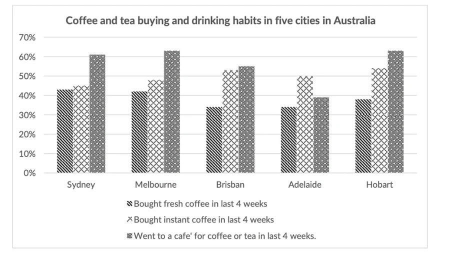
The chart below shows the results of a survey about people's coffee and tea buying and drinking habits in five Australian cities.
Summarise the information by selecting and reporting the main features, and make comparisons where relevant.
Mini Practice 54
WRITING TASK 1
You should spend about 20 minutes on this task.
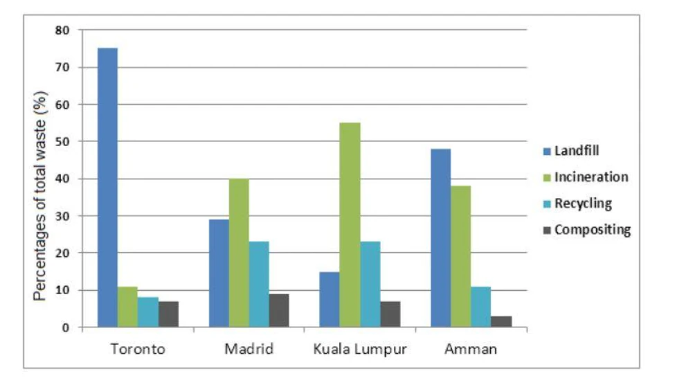
The bar chart illustrates the information about four different methods of waste removal.
Summarise the information by selecting and reporting the main features, and make comparisons where relevant.
In this section, you need to address both comparison and trend in the given table.
Table Chart
Warm-Up 29
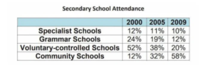
Look at the table below, and mention 2 main features from the picture!
The table shows the proportions of pupils attending four secondary school types
Warm-Up 30
Let's write your essay based on the table on Warm-Up 29 by following the provided outline below. Make sure that you write more than 150 words.
Writing Sample
The table below gives information about UK independent films.
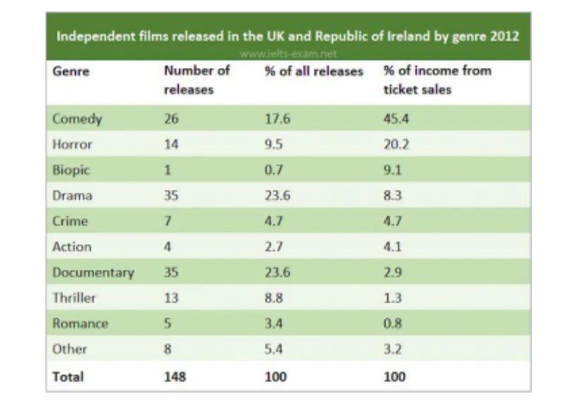
The given table illustrates information on ticket sales and the number of independent films which were released in 2012 in the UK and the Republic of Ireland.
In general, comedies received the highest income from ticket sales while the opposite was true for romance movies. Meanwhile, dramatical films and documentaries were the most prevalent films.
Looking at the table for more detail, dramatical genre and documentaries released the same quantity of 35 movies, which was the highest number of released films, accounting for 23.6% of the total releases. Followed by comedies (26 movies), making up 17.6% of the overall released films. In contrast, there was 1 biopic genre introduced and the proportion of releasing this type of film was only 0.7%.
In terms of income from ticket sales, the gain from comedies consumed 45.4% of total income from tickets. Besides, horror movies received about 20.2% and ranked in 2nd place. The proportions of ticket income for biopic and drama genres halved those for horror ones. Nevertheless, romance films achieved the lowest ratio of income from ticket sales (only 0.8%).
Word count: 179 words
Band: 8
Mini Practice 55
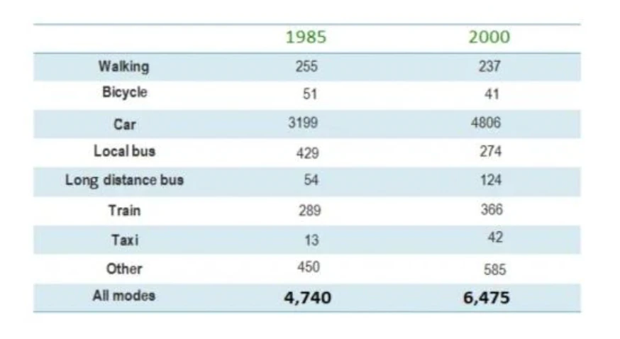
The table below gives information about changes in modes of travel in England between 1985 and 2000.
Summarise the information by selecting and reporting the main features, and make comparisons where relevant.
Mini Practice 56
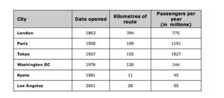
The table gives information about railway system of 6 cities
Summarise the information by selecting and reporting the main features, and make comparisons where relevant.