Pie Chart
Vocabulary Building
To say percentage:
75% or three-quarters or three out of every 4 people/penguins/patients/...
Example:
Other Structures:
| 1. | the | share contribution proportion percentage | of... |
Example:
Other Structures:
| 2. | x | formed accounted for Was responsible for comprised | y% of ... |
| y | contributed | y% to .... |
Example:
Other Structures:
| 3. | The remaining x% |
Example:
Warm-Up 27
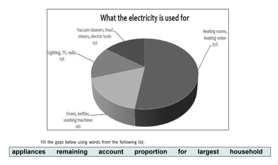
In an average English home, the of electricity, 52%, is used for heating rooms and water.
Three kitchen , namely ovens, kettles and washing machines, 18% of electricity use.
The 30% of electricity is used for lighting, televisions and radios (15%), and vacuum cleaners, food mixers and electric tools (15%).
Writing Sample (Band 8)
Source: writing9.com
The pie graph show the nutritional consistency of two dinners
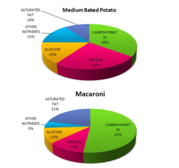
The pie graphs illustrate the way nutrients are distributed in two dishes for dinner: medium baked potato and macaroni.
Overall, it can be noticed that both dinners have the highest proportion of carbohydrates.
Besides, the medium baked potato includes the least level of fat.
As can be seen, the percentage of carbohydrates in macaroni makes up 52% which is 17% more than that in the baked potato dish. Meanwhile, saturated fat contributes to 21% of macaroni and this figure is nearly twice as much as that of dinner including potato.
According to the two given pie graphs, the second dominant nutrient in baked potato belongs to protein accounting for 25%, while that in macaroni only halves. In addition, the amount of glucose in macaroni is the same as that of protein in this dish. The share of glucose in the medium baked potato is 4% more than that in macaroni
Word count: 151 words
Mini Practice 51
WRITING TASK 1
You should spend about 20 minutes on this task.
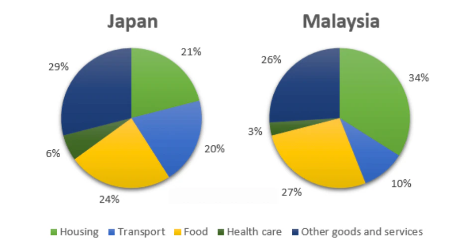
The pie charts below show the average household expenditures in Japan and Malaysia in the year 2010.
Summarise the information by selecting and reporting the main features, and make comparisons when relevant.
Source: writing9.com
Mini Practice 52
WRITING TASK 1
You should spend about 20 minutes on this task.
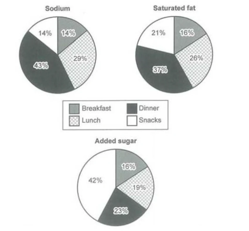
The charts below show the average percentages in typical meals of three types of nutrients, all of which may be unhealthy if eaten too much.
Summarise the information by selecting and reporting the main features, and make comparisons when relevant.
Source: Cambridge IELTS Academic 14